For Edmonton restaurants, is imitation the sincerest form of fattening?
Posted on May 14, 2011 By Rob Drinkwater Dining, Front Slider
 In less-prosperous corners of the planet, where trademark laws aren’t among the legal system’s uppermost priorities, you may have noticed things like a knockoff McDonald’s with three golden arches, a 6-Eleven corner store, or a Hard Rock Cafe which lacks celebrity memorabilia and that you enter through a hole in a wall.
 That rarely happens here, thanks to the federal Trade-mark Act, which allows owners of registered trade names and logos to seek redress from would-be imposters.
Still, there are bar and restaurant owners in Edmonton who push the envelope. And sometimes they succeed in imitating an already successful brand name.
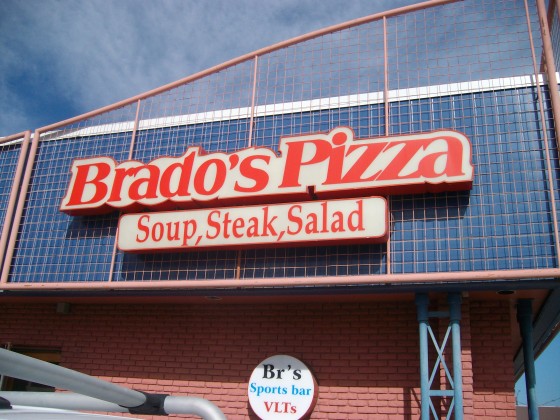
Brado Kamal doesn’t deny the signs on Brado’s Pizza look like Boston Pizza signs. In fact, he says there’s a very good reason they do.
 Back when Kamal was looking to purchase signs for his restaurant in 1998, he says he visited the same sign builder who leased signs to Boston Pizzas in Edmonton. There were some old frames for Boston Pizza signs which Kamal says were on their way to the dump, so he says he bought them to save money.
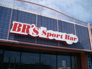
Kamal says he got new plexiglass plates made that said “Brado’s Pizza” to fill the Boston Pizza-shaped frames. Originally, the bar section of his restaurant was called “BP’s Lounge,” too.
 “A lot of the franchise people came by and were making a big stink and were taking photos. They complained to the Boston Pizza head office that they were paying all these franchise fees and I was just copying,” Kamal says.
“They sent me a letter telling me to cease and desist, or whatever. I phoned up their head office — they were really good about it. They were laughing. I was laughing.”
In the end, Kamal says he simply changed his bar to “BR’s Sports Bar” and that was the end of it as far as Boston Pizza was concerned.
 “They can’t trademark the lettering. You can’t trademark a font as far as I know,” Kamal says.
Not exactly. According to Section 6 of the Trade-mark Act, “…the degree of resemblance between the trade-marks or trade-names in appearance” is taken into account when determining whether a business is using a name or mark that might be confused with one used by the trademark’s registered owner.
Boston Pizza’s media affairs spokesman was contacted about this story earlier in the week but had not responded by the time of publication.
There are other cases in Edmonton, some of outright copying, and other cases where only suggestive elements of the trademarked logo’s style are present.
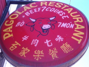
The two Pagolac Restaurant locations in the city both have signs with what can only be described as identical versions of the laughing cow on “La Vache Qui Rit” brand of processed cheese.
According to the Canadian website of Fromageries Bel, the French-based manufacturer of the cheese, the current version of the cow was inspired by a drawing that was the symbol for a military unit in the First World War.
The only difference in the cow on the Pagolac version is that the cow’s ear rings are blank on the Vietnamese restaurants’ signs, whereas on the Bel product they are wheels of cheese.
Neither the downtown nor the south-side location of Pagolac have much to say on the issue.
Does anyone ever comment that the cow resembles the one on the cheese?
“No,” was the response from the person who answered the phone at the downtown Pagolac.
Has the cheese company ever given you any trouble?
“No.” Then the line went dead.
A person who answered at the south-side Pagolac admitted that diners do sometimes remark the cows are similar. He promised to phone back later, but never did.
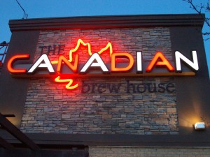
The case of whether the signs on The Canadian Brewhouse locations in Alberta resemble Molson Canadian beer logos is much more subtle. True, the style used for the lettering in “Canadian” in the restaurant signs is completely different that the beer’s, and the maple leaf is behind “Canadian” in the restaurant sign instead of on top of it.
But there’s something about the way colours of the letters alternate, even though it’s red-and-white with the restaurant and red-and-blue with the beer.
Maybe we’re just imagining things. And in any case, is there really any chance of confusion?
Kamal says no one ever mistakes his place for a Boston Pizza. He has nothing against Boston Pizza and even eats there sometimes, but he says his place is different.
“It’s not a franchise. It’s a better product. It’s homemade,” he says proudly.
Sometimes you can be running a restaurant with a perfectly good name for decades when all of a sudden, a big chain from another country shows up, says they hold the registration for the trademark and take you to court.
Such was the case of Domino’s Pizza vs. Domino Pizza House of Stephenville, Newfoundland which was filed in Federal Court in 1989. Claude Estoppey, a baker from Switzerland, opened his little pizza house in his adopted Newfoundland home in 1964. But there was trouble when Tom Monaghan, who’d named his Michigan pizza restaurant Domino’s about the same time, was expanding internationally in the 1980s. Estoppey died in 2000. But his daughter continues to run Domino Pizza House in Stephenville, and the building has a red-white-and-blue colour scheme.
The closest Domino’s Pizza is many hours away.
“I do believe there’s one outside by St. John’s, but we don’t make a big deal about it,” Lorraine Estoppey says.


