Lord of the Logos: Black Metal AF
Posted on December 30, 2016 By Mike Ross Archive, culture, Entertainment, Front Slider, Music, Visual Arts
 Seriously, metal dudes – what’s the point of having such a beautiful logo when you can’t read the name of the damned band?!
For an answer, we turn to the Lord of the Logos himself: Christophe Szpajdel, the prolific Belgian metalligrapher whose customers include Metallica, Rihanna and Foo Fighters, among an estimated 10,000 bands over four decades.
As usual with this particular subculture, the question leads down a rabbit hole filled with tangled sticks.

Guess the names of the bands! Answers below
On Skype from his home in Devon, England, Szpajdel says it doesn’t matter to him. He draws what the band wants. “Some clients want readable logos,” he says. “And some clients want, and they actually say, ‘We want it to be as black metal as fuck!’ The blackest of the black metal!”
That’s why they come to the Lord of the Logos.
He explains, “Some bands have more unreadable logos that look like a pile of branches, especially for this kind of Shamanistic cult of nature, totally underground band that would release an album limited to 100 copies. Like you may have heard of bands from the Cascadian Mountains, or Elemental Chrysalis, a Shamanistic, dark, ambient, shoegaze kind of band. They really connect with cult of nature, so they want tree branches – a black forest!”
Death metal bands, on the other hand, tend to favour variations on the spooky olde English gothic font. Some want more “frail” logos with the tree branches wilted and dying, also goat skulls, human bones, flames, dripping blood, razor blades, Satanic imagery, the Occult, things “that represent the dark side of humankind,” Szpajdel says. He goes into great detail on this subject. In an interview I was warned would take a long time – and it did – the Lord of the Logos is as exacting in his conversation as he is in his designs.
“When it comes to black metal,” he says finally, “there is a very large variation within many subgenres.”

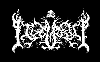
It says ‘Idolatry’
He can say that again. Even in this city – a metal haven due to its location inside the frigid Boreal forest – can be found a wealth of variety in the blackest of the black metal. The Lord of the Logos says he has worked with a number of Edmonton bands, including Sacramentary Abolishment, a black-slash-death metal band that was active in the 1990s.
The question of legibility is put to three local bands. It’s become a running joke in the scene. One CJSR DJ said he wouldn’t play music by a band whose name couldn’t be deciphered. Really, on the radio, what would be the point?
Display of Decay had a logo problem. Guitarist Sean Watson says the design had to be redone three times because no one could read the words. He says, “I find many extreme metal logos to be so over the top now that you need to ask the band what their name is, and I find that to cause a huge disconnect between artist and audience.”

Christophe ‘Mayhem-ized’ Metallica
Of course, if you’re asking the name of the band, you’ve probably already connected.
“A logo is a branding first and foremost,” says Drew Copland from Death Toll Rising. “Obviously, it helps if it is legible, but once you are established, it means so much more as a visual cue for people than what the letters actually say.”
From the black metal band Idolatry, drummer Chuck “Daemonikus” Murphy says, “Legibility is not always necessary if the artistry is of greater importance, where the logo becomes more of symbol than a word.”
The Lord of the Logos spends a lot of time listening to a client’s music before pen is ever put to paper. He talks with the musicians about what kind of image they want to portray, how they see their brand, and how to make sure the design is in harmony with their artistic vision.
“That is actually the most important thing,” he says. “The logo represents the identity of the band.”

The Lord of the Logos imagines GigCity as black metal AF
Born in Gembloux, Belgium to Polish parents, Szpajdel took up his trade in 1989, inspired by bands like Possessed, Slayer, Judas Priest, Black Sabbath, and many more he was into as a youth, and driven by his fascination for logos and brand design. His first job was for the Portuguese band called Morbid Death.
The Lord of the Logos had to practice his dark arts in secret.
“I was living with my parents until the age of 30 because I have done studies and listened to my parents, went to university for a degree in forestry engineering,” Szpajdel says. “I have a passion for nature and for trees, but my parents completely disapproved of my passion for metal and my passion for logos. They found there was no future and it could only bring me problems. They said most of the bands I drew logos for are not good people. They tried to stop me, but they did not manage to stop me – because I simply ignored them! I did my own thing.”
Now 46 years old, Szpadjel has a day job at the Co-op grocers in Exeter, England, “which I love,” he says, and spends almost all his spare time on logo design. It’s getting serious. He’s had exhibitions in London, Japan and Poland, and has published a book that bears his title, Lord of the Logos, the name bestowed upon him by a fan in 2006.

2016 was a big year for him. Szpadjel says he’s been getting a lot of requests since Rihanna hired him to design a custom logo of her name – which was used only once at the MTV Music Video Awards in August. He also did a commission for Metallica in October, to “Mayhem-ize,” as he puts it, the original Metallica logo for another single use in a music video. Seems like everyone these days wants to be as black metal as fuck.
He refuses to call Foo Fighters a “client.”
“It was a spontaneous sale,” Szpajdel corrects. The band was selling an ugly Christmas sweater last year, emblazoned with the Foo Fighters name crudely rendered (in knitted wool) to resemble the logo of the Norwegian black metal band Emperor. The original happened to be one of the Lord of the Logos’ creations. He was not pleased.

Better to settle than to sue
“That was an absolute shock,” Szpajdel says. “They were thinking it was a nod to me, but in fact it belittled me very seriously. It hurt me. How can my work be literally be mutilated in such a horrible way? I found it so unacceptable. I first thought about getting help to find who I have to sue, but then I changed my tactics.”
Szpajdel says he took it upon himself to do draw a “proper” black metal version of the Foo Fighters logo, and then posted it repeatedly on social media with requests for the band’s management to contact him. Eventually they did – and paid him $1,700 for full rights to the newly blackened design. Everyone was happy. Szpajdel is not afraid to disclose the sum he was paid, incidentally to provide more evidence that Dave Grohl really is a nice guy – and to illustrate that the Lord of the Logos takes his business very seriously.
ANSWERS:
1. Cwmbran (Wales)
2. Cold and Dead (Edmonton)
3. Barrowlands (Portland, Oregon)
4. Atra Mors (Italy)
5. Frozen Mist (Pennsylvania)
6. Pixie Ninja (Norway)
All artwork (and photo, below) by Christophe Szpajdel, except for Idolatry logo


